Creating Simple Visuals That Tell a Story (and When to Use Them)
Published on: November 5th, 2025
Why Visuals Matter
While spreadsheets offer unfiltered information and are valuable, they can be messy. Information is not only scattered, but it is also difficult to make sense of it. However, a well-placed chart can tell your business story faster than a spreadsheet of numbers ever could.
Visuals turn raw data into actionable insight when used correctly. They help you draw meaningful conclusions, guide decision-making, and develop strategies. Visuals give you an accurate snapshot, explain why something is happening, and can suggest a specific action you can take to achieve a desired outcome.
Types of Visuals
Bar Charts: They compare categories at a glance
Use case: Compare different items side by side.
Example: Leecious Groceries wants to see which product categories brought in the most revenue in June.
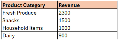
Use a vertical bar chart here to show each product category on the X-axis and revenue on the Y-axis. Bar charts help spot the top-performing and underperforming areas immediately.
Revenue by Product Category
2. Pie Charts: They show percentages of a whole.
Use case: Display how a total breaks down into parts. It is advised not to show more than 4–5 categories.
Example: What percentage of total revenue came from different services?
Deliveries – 10%
Walk-in Customers – 35%
Online Orders – 55%
Revenue Sources
A pie chart is perfect when the slices aren’t too many or too close in size. Otherwise, a bar chart captures the data better.
3. Line Graphs: They show trends over a period.
Use case: To show changes or patterns over time - from days, weeks, months, and years.
Example: Leecious Groceries tracks weekly sales over 6 weeks:
Revenue By Week
A line graph connects the dots to show growth, dips, or seasonality in sales.
Pro Tips using color:
Use consistent colors for categories.
Highlight the highest or lowest points if you want to draw attention.
Avoid too many colors in your visual or dashboard. Your audience should focus on the insight, not the color scheme.
Wrap up
Do you want to try creating these charts in Excel or Google Sheets? Let’s walk through one together.
Let’s build a bar chart:
Enter your data (e.g., product categories and sales) to create a table.
Highlight the table you just created.
Go to:
Excel: Insert → Charts → Bar Chart
Google Sheets: Insert → Chart → Chart type: Column chart
Add a title and labels.
Your bar chart is ready to go!
Need help creating visuals that tell stories over time?
Let’s guide you through your data.